01
User flows and information architecture
Define navigation, task sequences, and content structure before investing in high-fidelity visuals.
Stage 3 · Design
Shape usable flows and interfaces that match brand, accessibility expectations, and the realities of how people complete work.
Design is where strategy becomes something people can navigate. We map flows, define information architecture, and craft interfaces that reduce friction, especially on the journeys that drive adoption, conversion, or operational efficiency.
We work with design systems and component patterns so UI stays consistent as features grow. Accessibility is treated as a quality baseline (structure, contrast, focus, semantics), not a late audit surprise. Brand fit matters, but clarity and task success matter more.
Design and engineering stay coupled: interactive specs, states, and edge cases travel with mockups so implementation does not invent behavior in the gaps.
How Technisal helps
Flows first, pixels with purpose, and a system that scales beyond the first screen set.
Define navigation, task sequences, and content structure before investing in high-fidelity visuals.
Progress fidelity as decisions stabilize, fast iteration early, polished UI when structure is sound.
Establish reusable patterns, tokens, and components so new screens inherit consistency and speed.
Account for keyboard use, contrast, labels, error messaging, and inclusive interaction patterns during design, not only after build.
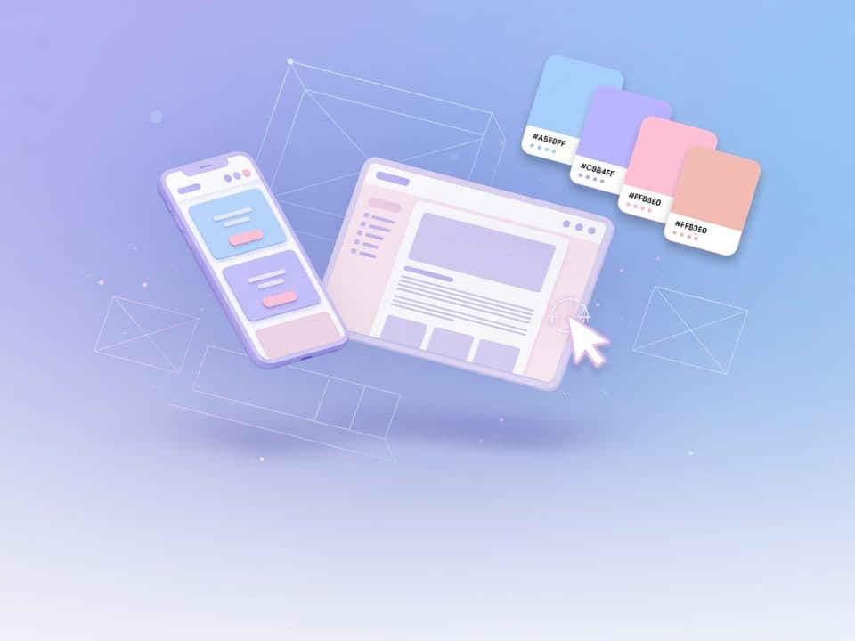
Apply visual identity within usability constraints so the product feels on-brand without sacrificing clarity.
A practical path from shared understanding to durable outcomes in ux and ui design.
Anchor design in discovery outputs: primary users, critical tasks, and success moments.
Sketch flows and low-fidelity options; resolve navigation and content hierarchy with stakeholders.
Detail key screens, states (empty, loading, error, success), and edge cases engineers must implement.
Review with users or proxies when possible; lock a component library that supports ongoing delivery.
Fewer implementation guesses
Engineers receive flows and states that reduce ad-hoc UI decisions in code.
Coherent product surface
Screens share patterns, reducing cognitive load for users and maintenance cost for teams.
Inclusive by design
Accessibility considerations enter early, shrinking expensive late remediation.
Domain realities that shape architecture, compliance, and product choices, addressed explicitly in our work.
Industry practice around design systems shows that shared components and tokens improve consistency and speed as product surface area grows. We invest in system thinking early enough to avoid one-off UI debt.
WCAG-oriented design and inclusive patterns expand who can use the product and reduce legal and brand risk. Baking a11y into design is more effective than bolt-on audits after visual freeze.
Even lightweight validation with target users or domain proxies surfaces navigation and language issues that internal review misses. We prioritize tests on high-risk flows.
No. We also redesign existing products, improve conversion or task completion on critical paths, and extend design systems already in use.
We overlap design and build when risk allows, stabilizing structure first, then detailing screens ahead of the sprint that implements them.
Yes. We adopt your tools and libraries when they exist, and strengthen them where gaps slow delivery or create inconsistency.
Share your users, brand, and critical journeys. We will design interfaces that are usable, implementable, and ready to grow with a system.